How to Teach Chart Evidence
A practical guide for teachers and instructional coaches who want to help students critically evaluate what charts can and cannot support.
Why Teaching Chart Evidence Matters
Picture a seventh-grade science class. The teacher shows a bar chart of average temperatures in two cities over a year. A student raises their hand and confidently declares, "This proves that City A is warmer than City B every month!" But the chart only shows monthly averages—not daily variability, not seasonal extremes, and certainly not proof.
That student has accepted the chart’s claim without questioning its evidence base. Scenes like this happen every day. Students see charts in textbooks, news articles, and social media, and they often take them at face value. Without explicit instruction, they struggle to distinguish between what a chart shows, what it suggests, and what it cannot support.
This gap leaves them vulnerable to misinformation and shallow reasoning. Teaching chart evidence is not an optional enrichment—it is an essential skill for any data‑literate citizen.
This article draws on the practical frameworks and classroom routines developed by Chart‑Ed to give you clear, actionable strategies for helping your students become critical consumers of data visualizations.
What Is Chart Evidence?
Before teaching evaluation skills, we need a shared definition. Chart evidence consists of the data points, labels, axes, and visual relationships directly encoded in a chart. For example, in a scatter plot of height versus age, the evidence is the collection of (age, height) coordinates.
It does not include interpretations like "older children are taller" unless that relationship is explicitly shown and statistically supported. Evidence is different from inference. An inference is a conclusion drawn from evidence—often plausible but not certain. Opinion is a personal judgment that may ignore the evidence entirely.
By making these distinctions clear to students, we give them a mental model for separating what they see from what they think. A simple classroom exercise: display a simple bar chart and ask, "What evidence do you see?" (only what is drawn) vs. "What might you conclude?" (an inference). This foundational activity sets the stage for deeper evaluation.
The Data Ascent Framework: Scaffolding Evidence Evaluation
Chart‑Ed’s Data Ascent framework [1] provides a spiral of increasingly sophisticated data interpretation skills. It moves students through three levels:
- Literal reading: Identify explicit information (e.g., "The blue bar is taller than the red bar").
- Pattern inference: Notice trends, clusters, or outliers and state them tentatively (e.g., "It looks like the blue group tends to have higher values").
- Evidence evaluation: Judge the strength and limits of the evidence (e.g., "The sample size is small, so we can’t be sure this pattern holds for a larger population"). This progression is powerful because it starts with concrete observation and builds toward critical analysis. Teachers can sequence activities so that students first practice describing what a chart shows, then discuss possible implications, and finally question whether those implications are warranted. To implement Data Ascent in your classroom:
- Use think‑alouds to model each level: "I notice the line goes up. I wonder if that means… But I also notice only three data points, so I’m not confident."
- Provide sentence frames: "The chart shows that ___," "This might suggest ___," "However, the chart does not tell us ___."
- Have students annotate printed charts with colored pencils—literal observations in green, inferences in yellow, and evidence limitations in red.
Data Forensics: Spotting Misleading Evidence
Even when students correctly read a chart, they can be misled by deliberate or accidental distortions. Chart‑Ed’s Data Forensics activities [2] train students to look for common manipulation techniques:
- Scale manipulations: A truncated y‑axis can exaggerate differences.
- Cherry‑picked data: Showing only a convenient subset of the data.
- Missing context: Omitting a control group, baseline, or uncertainty measure. A typical Data Forensics warm‑up: show two versions of the same data—one with a fair axis and one with a distorted axis—and ask, "Which chart would you trust more? Why?" Then challenge students to ask, "What’s missing?" whenever they encounter a chart. Specific classroom moves:
- "Spot the problem": Project a chart with a suspicious feature (e.g., a pie chart where the percentages don’t add to 100) and rapid‑fire ask students what red flags appear.
- "Be the editor": Give students a poorly constructed chart and have them redraw it honestly, explaining each change.
- "Correlation or not?": Show a scatter plot with a clear outlier and discuss how that single point changes the apparent pattern.
Structured Discussion Routines for Evidence Talk
Effective chart evidence instruction relies heavily on student talk. Chart‑Ed’s Classroom Discussion Routines [3] provide structures that make evidence evaluation visible and collaborative. One protocol that works seamlessly with these discussion routines is Claim‑Evidence‑Reasoning (CER), widely used in science and across subjects. The routine:
- Claim: State a conclusion about the chart.
- Evidence: Point to specific data in the chart that supports the claim.
- Reasoning: Explain how the evidence connects to the claim and identify any limitations. For example, in a lesson on fertilizer and plant growth (see the full flow below):
- Claim: "The plants with fertilizer grew taller than those without it."
- Evidence: "The average height with fertilizer is 18 cm, and without it is 12 cm, as shown by the bar lengths."
- Reasoning: "This difference suggests fertilizer might help, but we only tested one type of plant and didn’t control water or sunlight, so we can’t be sure it caused the growth." To support this routine, post an anchor chart in your room with sentence starters for each step. With practice, students internalize the pattern and begin to apply it independently. Use a CER anchor chart or resource-library version once the publication link is confirmed.
The Correlation‑Causation Trap
Perhaps the most stubborn challenge is teaching students to avoid confusing correlation with causation. Two variables may move together without one causing the other. A classic example: ice cream sales and drowning rates both increase in summer, but eating ice cream does not cause drowning. The relationship is due to a third variable—hot weather.
In charts, this trap often appears when lines or bars appear to move in tandem. A high‑school social studies class might analyze a dual‑axis line graph of unemployment rates and presidential approval ratings. If the axes are manipulated, the chart can falsely imply a direct link.
Data Forensics techniques help students spot these manipulations and ask the right questions: "Could other factors explain both trends?" "What would a controlled study need to look like to establish causation?" Teach the language of correlation: "associated with," "linked to," "tends to co‑occur."
Insist that students qualify causal claims unless the data come from a well‑designed experiment. Explicitly discuss the difference between observational and experimental evidence, and model the phrase "further evidence would be needed to show cause and effect."
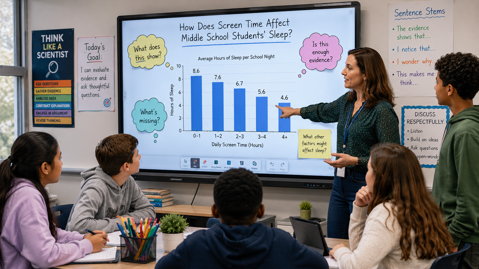
A Sample Lesson Flow: Middle School Science
Let’s walk through a lesson that integrates all three Chart‑Ed strategies, using the middle school science example of a bar chart comparing plant height with and without fertilizer. 1. Launch with Data Ascent Show the chart. Ask students to write one literal observation and one inference, using the scaffolded language from Data Ascent.
Pair‑share, then discuss as a class, categorizing statements as “reading the chart” or “reading beyond the chart.” 2. Apply Data Forensics Pose: "What could be wrong with this chart? What don’t we know?" Students might note the small number of plants, the lack of replicates, or the absence of other growing conditions.
This forensic lens encourages healthy skepticism. 3. Structured Discussion using CER Display the anchor chart for Claim‑Evidence‑Reasoning. In groups, students construct a CER statement. A typical output: "Claim: Fertilizer is associated with taller plants. Evidence: The bar for fertilizer is one‑third taller.
Reasoning: Because we didn’t control other variables, we can’t say fertilizer caused the growth; we can only say there’s a difference." 4. Highlight Correlation vs. Causation Directly address the correlation‑causation distinction. Ask: "What would we need to change about this experiment to test for causation?"
(Answer: control variables, random assignment, larger sample). 5. Exit Ticket End with a written prompt: "What is one thing this chart cannot tell you?" Collect responses to assess students’ grasp of evidence limits. This flow works across many subjects. Swap in a social studies chart or a math class survey graph, and adjust the questions accordingly.
Honest about Evidence Limits
It is important to be transparent: the strategies described here are based on practitioner experience, design principles, and alignment with educational research on argumentation and visual literacy [4]. They are not yet supported by large‑scale randomized controlled trials of Chart‑Ed products.
We share them because they reflect coherent frameworks that many teachers have found effective. This does not mean the strategies are ineffective—it means we lack definitive proof of causality.
As you try these moves in your classroom, consider gathering your own evidence: collect student work samples, record discussions, and note changes in their reasoning over time. This approach places you, the teacher, in the role of action researcher—exactly where you belong.
Building a Classroom Culture of Critical Data Thinkers
Teaching chart evidence is not a one‑off lesson; it’s a habit of mind. By weaving Data Ascent’s progressive questioning, Data Forensics’ skeptical lens, and structured discussion routines into your regular practice, you can cultivate a classroom where students instinctively ask, "What does this chart really show? And what does it not?" Start small.
Pick one routine—perhaps the “What’s the evidence?” protocol—and use it three times this week. Post a simple anchor chart with the correlation‑causation phrase “associated with” and see what happens when students adopt it. Over time, you will notice a shift: from passive chart consumers to active, critical interrogators of data.
And in a world awash in charts, that might be one of the most important gifts we can give our students.
References
- Chart‑Ed (n.d.). Data Ascent. Internal framework document.
- Chart‑Ed (n.d.). Data Forensics. Internal activity set.
- Chart‑Ed (n.d.). Classroom Discussion Routines. Internal protocols.
- National Research Council. (2012). A Framework for K‑12 Science Education: Practices, Crosscutting Concepts, and Core Ideas. Washington, DC: The National Academies Press. (Additional bodies of research, such as the NCTM process standards, provide similar support for explicit instruction in evidence evaluation.)