How Students Learn to Trust Data Too Quickly
The Trust Trap
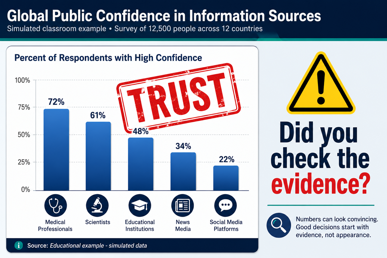
It’s a Tuesday morning. You project a colorful infographic onto the screen—bar chart soaring upward, bold title declaring “The Shocking Truth About Social Media Use.” Almost immediately, a student calls out, “See? Social media is destroying our generation.” Murmurs of agreement ripple across the room.
No one asks about the y‑axis, the source of the data, or what “shocking” actually means. The chart looks authoritative, so it must be true. If this scene feels familiar, you’re not alone. Teachers across subjects encounter a quiet but urgent challenge: students often trust data visualizations too quickly.
Their snap judgments are shaped not by evidence but by visual polish, authority cues, and confident labels. And in a world saturated with charts and infographics, that premature trust can short‑circuit the critical thinking we work so hard to build. > **Did This Happen to You? ** > Think about the last time you asked students to interpret a chart.
How many looked past the colors and fonts to question where the numbers came from? How many paused, or asked what evidence was missing? If your answer is “not many,” you’ve just identified a teachable moment. Jot down one phrase you might use next time to interrupt that automatic trust. Then share it with a colleague.
This article unpacks why students default to trust, what research tells us about the influences at play, and how the Data Forensics framework—and tools like the Quick Trust Card—can help you shift your classroom from passive acceptance to active inspection.
Why Quick Trust Is a Data Literacy Problem
Quick trust isn’t just a minor classroom quirk; it’s a significant barrier to critical chart reading. When students accept a visual at face value, they skip the very steps that define data literacy: questioning, sourcing, and evaluating evidence. Over time, this habit can become entrenched, leaving them vulnerable to misinformation dressed up as data.
Consider what research tells us. The Stanford History Education Group’s Civic Online Reasoning assessments (Wineburg, McGrew, Breakstone, & Ortega, 2016) reveal that adolescents frequently judge the credibility of online content by its design and superficial trappings, not by investigating the source.
While these studies focused on websites and social media posts, the pattern is strikingly similar: students rely on surface cues instead of evidence.
Additionally, studies in the information visualization community show that adult participants—and likely students as well—tend to rate aesthetically pleasing charts as more trustworthy, even when the underlying data is flawed (Pandey et al. , 2014; Bateman et al. , 2010). Direct research on K–12 students’ trust in data visualizations is still limited.
But the converging signals from adolescent digital literacy and adult perception studies are enough to raise a red flag. When a chart looks good, sounds official, and speaks with certainty, the brain takes a shortcut. Our job as educators is to help students notice that shortcut and choose a more evidence‑conscious path.
The Invisible Hand of Visual Polish
Visual polish is the first and most powerful force that pulls students into premature trust. Chart designers know that color harmony, clean layouts, and professional fonts make information feel more credible. A cascading 3‑D bar chart, a sleek gradient background, an elegant sans‑serif font—these elements whisper, “This is legitimate, don’t doubt it.”
Studies in visualization research confirm this effect. For example, Pandey et al. (2014) found that participants gave higher trust ratings to charts that were merely “prettier,” even when those same charts used less accurate data.
The mechanism is likely perceptual and emotional: beauty triggers a positive response, which spills over onto the perceived truth of the information. And students, who are still learning to separate form from content, are especially susceptible. **The Trust Trap chart. ** Imagine a flashy infographic titled “Social Media Anxiety Rises 300%.”
A bold blue bar reaches almost to the top, a tiny arrow points upward, and a footer claims “Data from the National Digital Habits Survey.” At first glance, it screams legitimacy. But look closer: the y‑axis starts at 50%, not zero—so the rise is exaggerated. The source is vague; no link, no methodology.
Yet countless students will accept it because the surface message is compelling. To help students see past polish, try this low‑stakes activity: > Try This: The Visual Trust Audit > Project a polished chart (real or adapted) and ask your students two simple questions: > 1. What makes this chart look trustworthy? > 2.
Now, what might make it less trustworthy than it appears? > Record their answers, then reveal any hidden distortions. This “search and inspect” language—look trustworthy, might make it less trustworthy—gives students permission to doubt without feeling cynical.
Authority Cues and Confident Labels
Even when a chart isn’t especially beautiful, other features can invite quick trust: official‑looking logos, institutional names, and confident language in the title or annotations. A chart headlined “Data from the U. S. Department of Education” feels verified. A caption that says “clearly shows” discourages second‑guessing.
Students unconsciously assume that if an authority is attached, the evidence must be solid. Adjacent evidence from the Civic Online Reasoning work backs this up. SHEG found that students trusted websites with . org domains or professional‑looking logos far more often than they should have, without checking the organization behind them (Wineburg et al.
, 2016). In our own classrooms, we’ve seen eighth graders take a chart labeled “United Nations Annual Report” as gospel, never mind that the graph was lifted from a biased policy brief. Authority cues bypass critical circuits. Confident language works similarly.
While the direct research base on chart labels is thin, classroom observations and related work in science communication suggest that absolute phrasing (“proves,” “undeniably shows”) may reduce scrutiny, while hedges (“may indicate,” “suggests”) invite more careful engagement (see, e. g. , Hyland, 2005).
In chart reading, bold declarative labels seem to lower students’ inclination to ask, “What else could this mean?” or “Where is the evidence for this claim?” The chart tells them what to think, so they don’t think to check. The implication is clear: we must explicitly teach students to identify and question these cues.
Knowing what triggers premature trust is only useful if we know how to interrupt it, and that is where Data Forensics becomes practical. Make it a routine: “When you see an official logo, ask, ‘Who made this chart, and why?’ When you read a confident title, ask, ‘What evidence would I need to believe this claim?’”
This simple move turns authority and assertion from blind trust triggers into prompts for deeper investigation.
Slowing the Click: Data Forensics in the Classroom
So how do we interrupt these automatic responses? The Chart‑Ed Data Forensics framework offers a practical, classroom‑ready approach. When Chart‑Ed publishes the Quick Trust Card resource page, add the verified download link here; until then, the routine below can be used directly from the article. At its heart are three core questions:
- Where did the data come from? (sourcing)
- How was the chart built? (construction)
- What story is it trying to tell? (analysis) From that framework, the Quick Trust Card becomes a concrete tool that embeds these questions into a routine. The card walks students through three deliberate steps before they form any conclusion: Pause, Inspect, Question. The Quick Trust Card Routine. A three‑step visual:
- Pause (⏸): Stop and notice your first reaction. Are you already convinced? Why?
- Inspect (🔍): Examine the chart carefully. Look at the axes, data labels, source citation, and annotations.
- Question (❓): Ask: What evidence is missing? What would a fair interpretation require? What would change your mind? You can use this routine with any chart, in any subject. In a science class, it might mean inspecting the axis scaling of a climate graph. In history, it could mean questioning the origin of a population trend chart. The key is repetition: the more students practice, the more natural the pause becomes. Pair the Quick Trust Card with the Evidence‑to‑Verdict discussion format. After pairs or small groups have inspected a chart, they collaboratively decide: on a scale of “Not Trustworthy” to “Trustworthy (with reservations)” to “Trustworthy,” where does this chart fall, and what evidence led them there? This structured deliberation teaches that trust is not binary; it’s a negotiation with evidence.
Routines That Build Healthy Skepticism
Beyond the Quick Trust Card, building a classroom culture of healthy skepticism requires daily, low‑stakes routines. Here are three ready‑to‑use moves that deepen chart‑reading habits without adding heavy prep. 1. Bell‑ringer Chart Inspection As students enter, project a chart—a news graphic, a textbook figure, a student‑created visual.
Give them 90 seconds to silently list three questions or observations on a sticky note. Questions might include: “I wonder why the y‑axis doesn’t start at zero,” or “Who collected this data?” This primes their analytical lens from the first minute of class. **2.
Peer Questioning Protocol** In pairs, one student states a conclusion they would draw from a chart, and the other student responds with one probing question: “What evidence supports that?” “How do you know the sample is large enough?” The goal is not to shoot down ideas but to elevate the level of evidence required.
Over time, students internalize these questions and start asking them of themselves. 3. Collaborative Verdict Discussions Using the Evidence‑to‑Verdict model, small groups examine a chart and come to consensus on its trustworthiness. They must cite specific features—sourcing, axis clarity, data labeling—to justify their verdict.
This public reasoning makes invisible thinking visible and sets a norm that opinions must be backed by evidence from the chart. > Teacher Reflection > Take a moment to consider your current practice: When a student quickly accepts a chart’s claim, what is your typical response?
How might you replace your current response with a pause routine or an evidence‑seeking question this week? Jot down one actionable change.
Preventing Cynicism: Trust but Verify
One of the most common concerns teachers voice is this: “If I keep telling students not to trust charts, won’t they become cynical? Won’t they dismiss all data?” It’s a valid worry, and it points to an important distinction. Healthy skepticism is not cynicism. Cynicism is a blanket refusal to believe anything. Healthy skepticism is a disciplined openness that asks, “What is the evidence, and is it enough?” The goal of Data Forensics is not to make students mistrust everything, but to make them careful and evidence‑driven. We can foster this by modeling constructive language:
- “I’m not sure yet—let’s find out more.”
- “This chart raises good questions; we should see what else we can learn.”
- “Even trustworthy charts have limitations; no single piece of data tells the whole story.” Explicitly teach the phrase “trust but verify.” When a chart comes from a reputable source, students can begin with tentative trust, then actively verify. This balance keeps the classroom a place of inquiry, not of suspicion. Moreover, celebrate moments when students request more evidence. “Great question—let’s figure out where we can find the raw data.” When “I need more evidence” becomes a valued and rewarded response, students learn that questioning is a sign of intellectual strength, not weakness.
From Passive Acceptance to Active Inspection
Premature trust in data visualizations is a natural, but addressable, habit. It arises from visual polish that seduces the eye, authority cues that silence doubt, and confident labels that forestall questions.
The research—from visualization studies to adolescent digital literacy—tells us this is a widespread challenge, even if the direct K‑12 data is still emerging. But teachers are not powerless.
By introducing routines like the Quick Trust Card, embedding evidence‑inspection questions into daily practice, and fostering a culture of healthy skepticism, we can slow the click from sight to belief. We can help students replace automatic acceptance with the deliberate, curious stance that true data literacy demands. Start small.
In your next lesson, try one of these strategies: project a misleading chart, use the Quick Trust Card steps described above, or simply pause and say, “Before we decide what this chart means, let’s look at what it actually shows.” The shift might feel subtle, but over a semester, it can transform how your students interact with the data‑saturated world.
Because in the end, we’re not just teaching chart reading. We’re teaching students to think before they trust—and that is a skill that lasts a lifetime.